
eCommerce Responsive Design
- what we did:
- We redesigned the experience across desktop, tablet and phone based on a content audit and user research.
- what we achieved:
- Sparhandy.de crossed 400 EUR million in revenue 2016 after the redesign
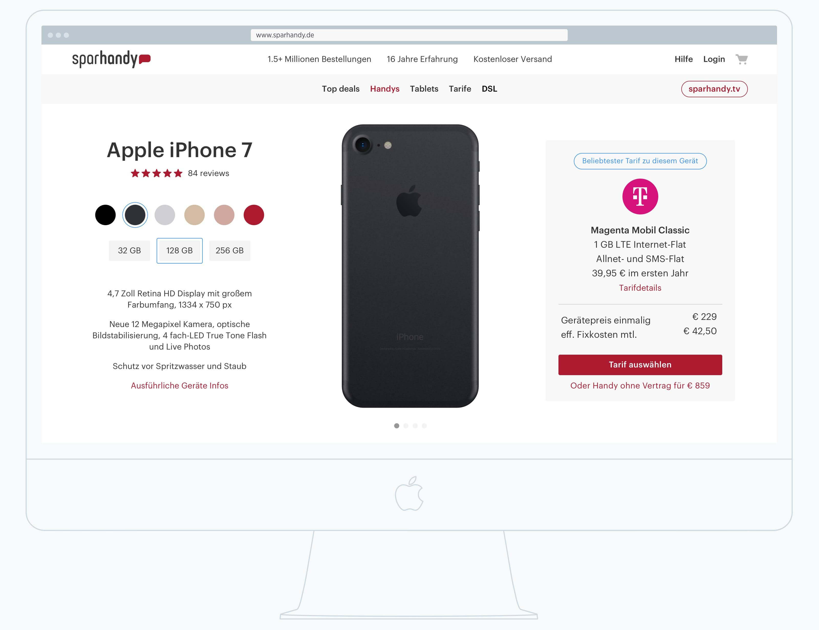
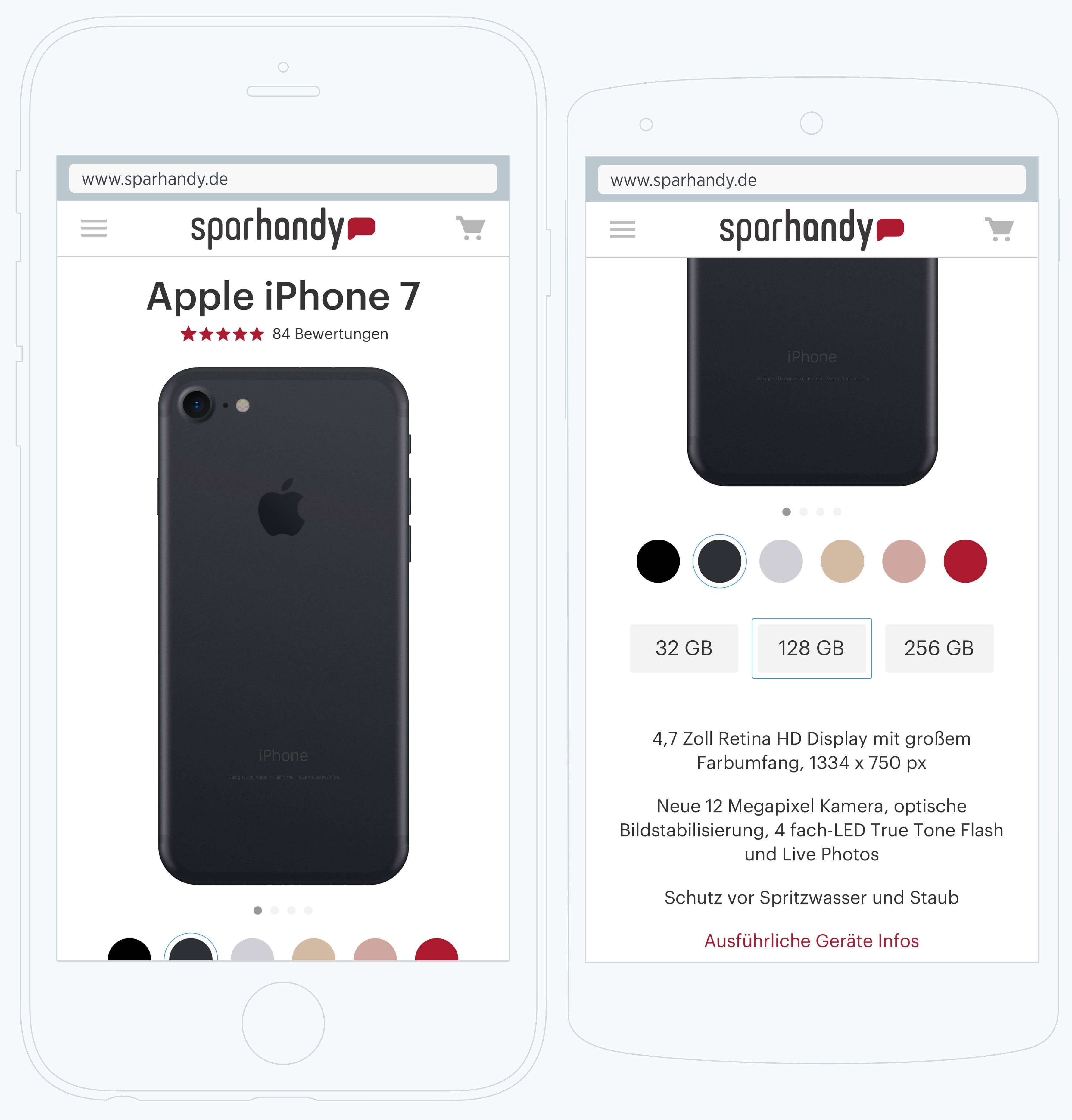

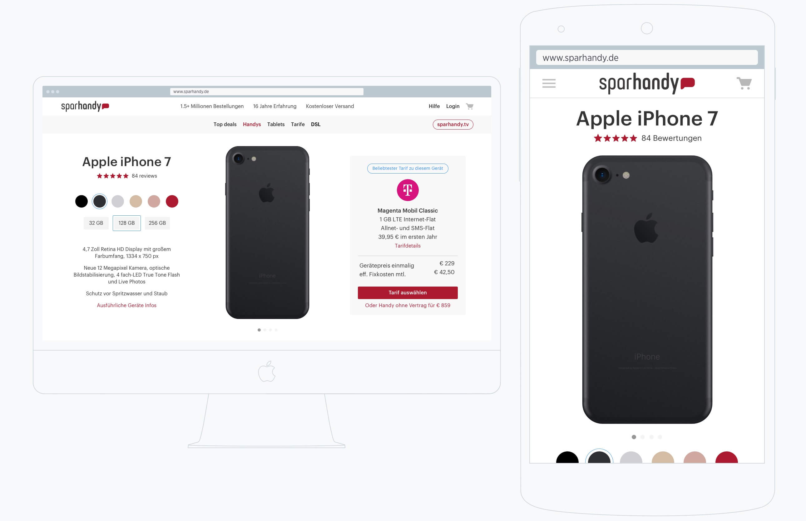
Sparhandy.de follows a simple ecommerce concept. Various device pages, category pages and all sorts of listing pages existed, alongside a plethora of landing pages for hundreds of different products that had been sold.
Over the years the online shop and its listing pages, product detail or search results pages had grown to a big conglomerate that lacked simplicity, clear consistency and visual coherency. On first glance, even for non-designers, pages looked distinct, almost self-sufficient. The components on listing and product detail page had barely any visual or behavioural consistency. UI patterns were designed for a specific case without modularity in mind. Visitors had to click through complicated search and listing pages with unintuitive UI components on nearly every single page.
Due to the technical development over the years the checkout was tricky. The same templates and logic are used for a handful of other shops on different domains for which sparhandy.de manages the entire process online and offline.
An interesting fact to note is that although revenue was not growing as strongly, customers were still buying in droves. The experience was not great but people still shopped even a tiny fraction on mobile.
A handful of competitors already had a fully responsive or adaptive site. Hence, surfers who visited both sites in their hunt for a good offer, likely experienced the oldish sparhandy.de and the more up-to-date experience on preis24 for example.
goals
The goal for blended for the project was to redesign the underlying UI architecture, to introduce a responsive behaviour across the most important consumer touchpoints (desktop and mobile) and to guide the internal team on the best practices for such an endeavour.
From a design perspective the entire site looked and felt very old. So, naturally a designer would jump into a redesign of the architecture and navigation model, design great behavioural components and apply a stunning visual design. What about technical requirements though? Well, it will be either responsive or adaptive, of course.
But what about the structure of the backend and its databases? Can the backend provide the data in ways that would allow the new components to function together as designed or expected? What part of the backend would need to be refactored so that we can use elements with asynchronous features, for example?
It was not easy to get those questions answered because the tech team was in a state of fundamental change at the outset of the project. The architecture of the backend was also set to be mostly rewritten in order to handle the requirements of a status-quo user interface and cross-platform experience.
This made some challenges easier because we had more flexibility: we could design interactions as if no technical requirements existed. On the flip side, it made it harder for us to come to conclusions and make decisions because of lacking technical considerations.
Sparhandy moved to a much more agile process within the tech and design teams. The process was welcomed and certainly required to master the above challenges. The knowledge of the overall company context, e.g. the inner workings within the tech and design team, helped to set the right expectations and goals.
A few weeks after blended joined the project, the technical team start the build-up of modular components for the backend to handle frontend requests in more flexible ways. The frontend does also depend on the new interaction and visual design. Hence, that process was not yet kicked off.
The technical direction for the frontend was set to use Bootstrap. We knew early one that the new visual appearance would be based on standard Bootstrap components. The reason for Bootstrap were not just technicalities but also market dynamics. It is easier to find a front-end engineer for Bootstrap than for Zurb's Foundation.
The constraints coming from Bootstrap were useful to start with the sites' front-end structure. But before going into sketching and wireframing, we needed to take a deeper look at the content.
We used an analysis tool that would return any link still available and valid for the entire site. The amount of valid links turned out to be around 70.000. Granted that those were mostly a handful of templates showing different products and SKUs, it turned out that the links also contained age-old pages with age-old products (still active in the database). Scrolling through the list to find each templates required for a redesign was not going to be fruitful. We needed a different approach.
We then chose a more qualitative. We surfed through the shop and checkout and jotted down each new page or template that we could encountered. This is a certainly not a valid approach for a university homepage for example but for an ecommerce site, it can work. We constructed a sitemap like overview of what we found and then touched base with the designer to help on what we had missed.
The qualitative approach can be tricky on certain projects because one misses pages and/or content that appears only on certain user interactions and/or input.
We now had a simple sitemap that contained about twenty templates and pages for the shop, checkout and static content such as company About, Career and so forth. The map also helped to determine which pages are static and dynamic template. This sitemap served as a design roadmap to set priorities, maintain context throughout the project and furthermore to focus discussion when needed.

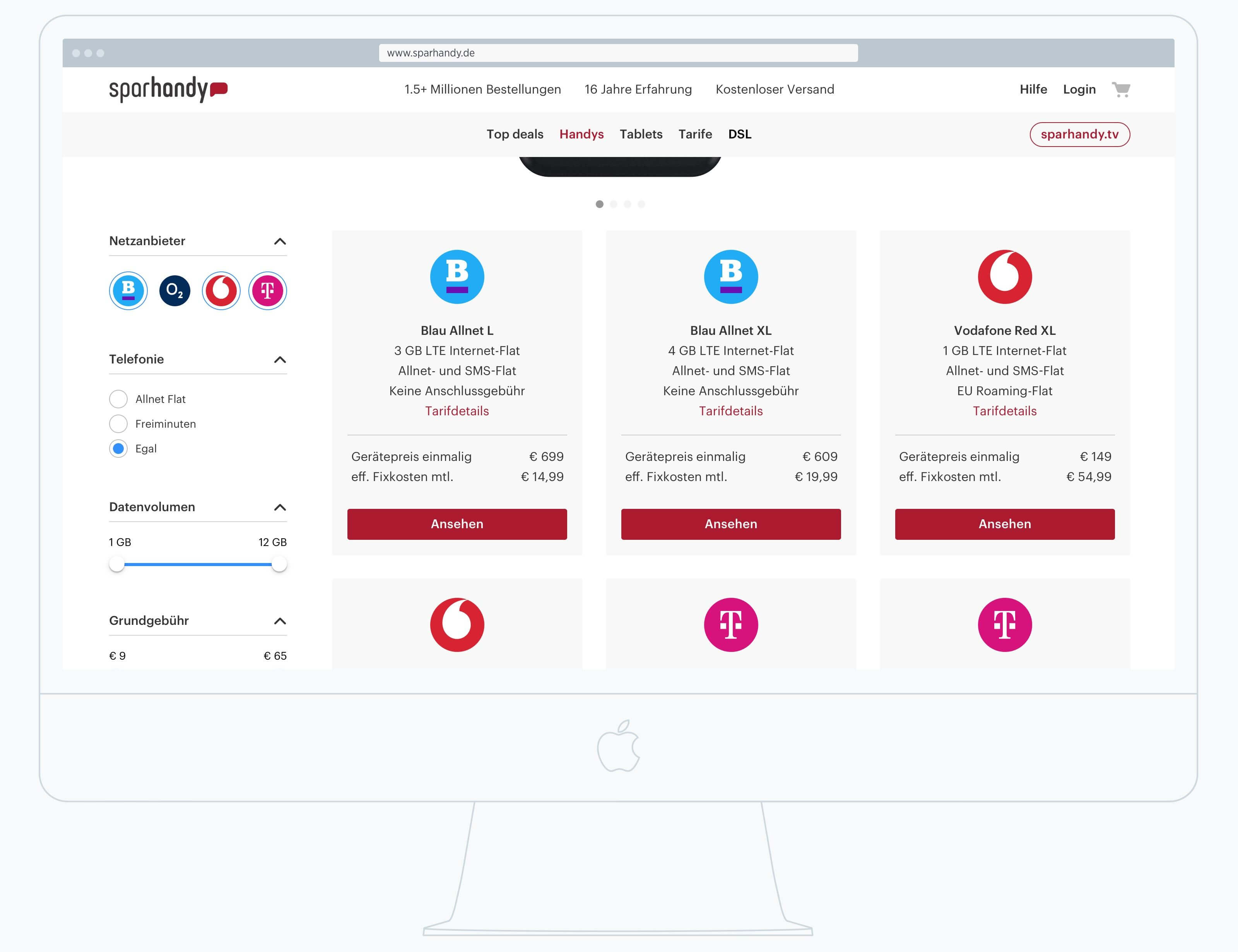
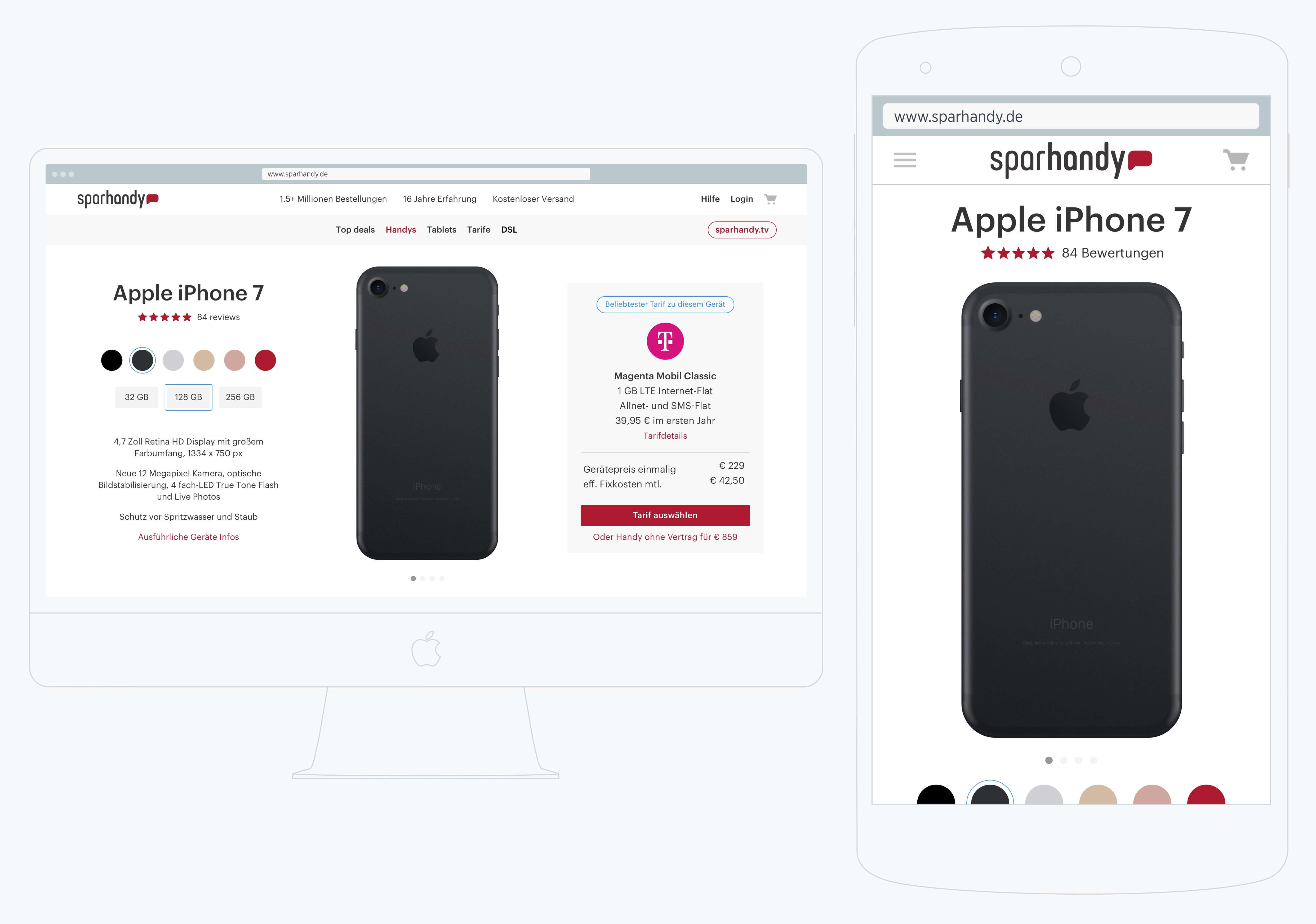
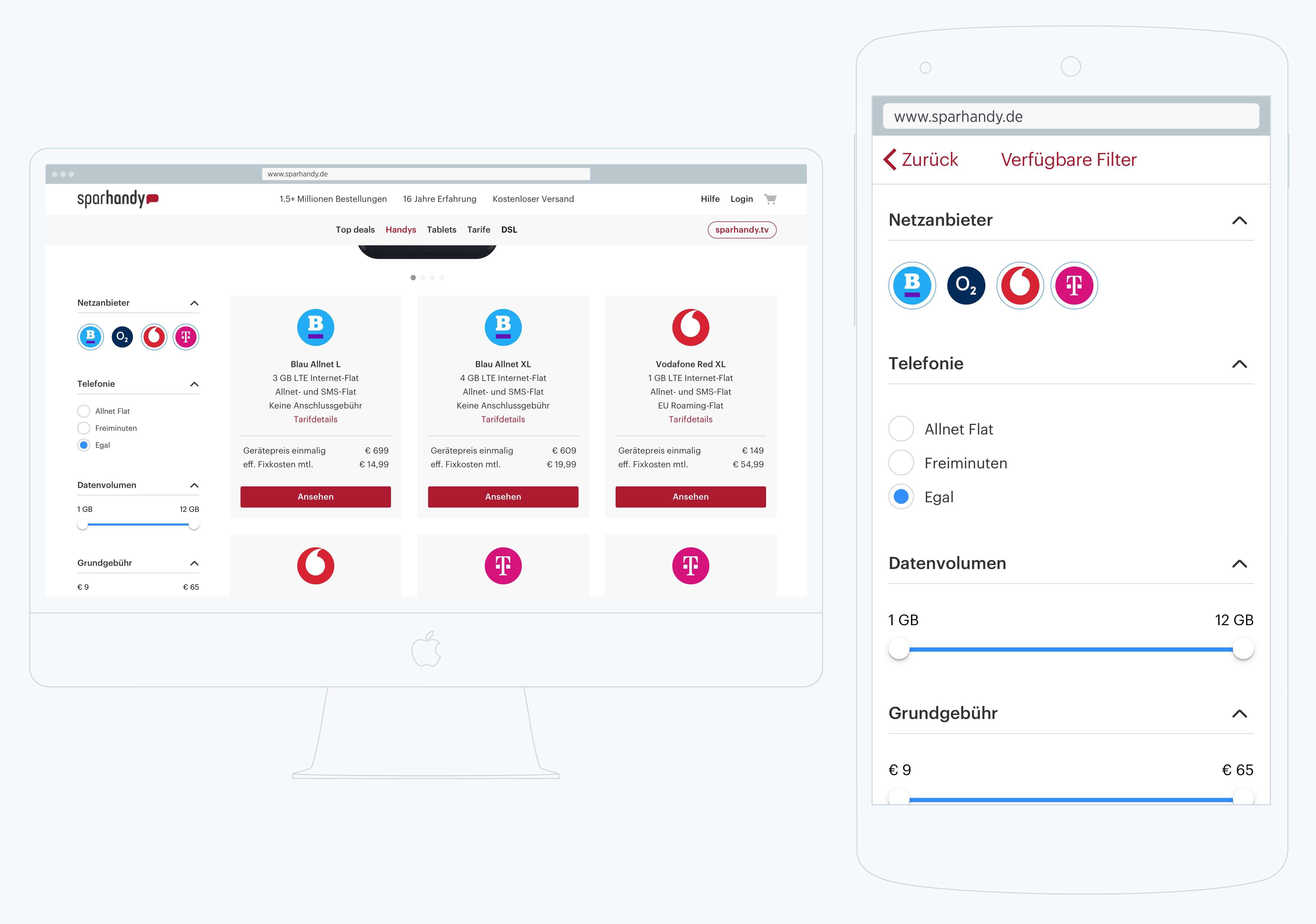
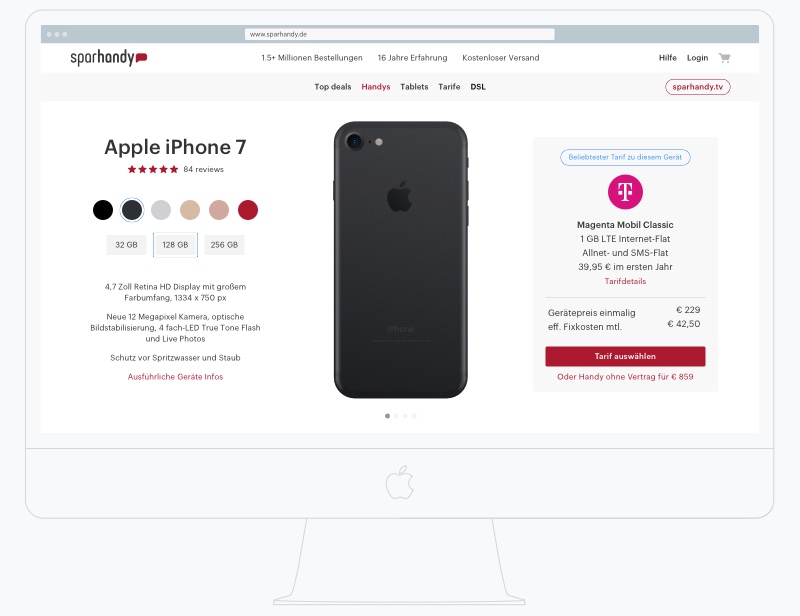
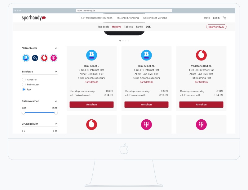
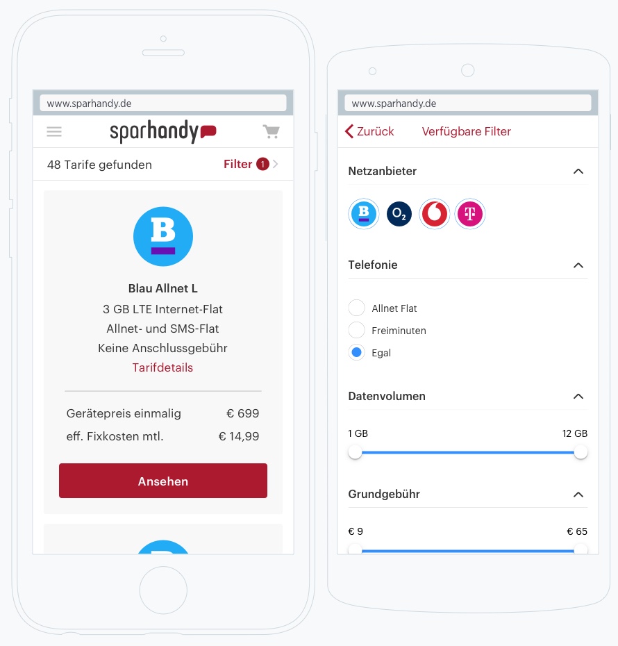
The search UI was brutal. The results list resembled a visual style common in 2003. Apart from elevating the site to at least competitor levels, our goal was to introduce a state-of-the-art search and filter feature. Visitors on the old site had no ability to filter for any product or tariff property. The solution to this is, of course, a filter column used on hotel and flight booking sites.
As briefly mentioned earlier, the site looked very 2003-ish. Small text, layouts based on tables (especially the search results list). Coupled with search, filter and responsive web design, those four capabilities were the real focus for the new UI architecture.
To build a design system from the start and to get the marketing's buy-in, we printed all page templates on paper and marked all would-be components and elements. The issue was that often elements that were supposed to be the same were differently implemented on another page. We also marked on the print-outs what template would get a filter column for example.
The exercise resulted in a collection of coherent templates and reduced the amount needed across the site. The print-outs on the wall made a huge difference to how the project appeared to people who were and were not directly involved. Interesting to note is that the annotated print-outs seemed like as if we had already made process in regard to a more coherent experience.
At the get-go we did not know whether the tech team would chose an adaptive or fully responsive approach for the frontend. For the user the final experience is very similar but for designers the different technical solution do matter. One difference between these two approaches is speed. Fully responsive UIs carry more data which will also be send to smartphones. As the code to be rendered on the device does not change for smartphones for example.
Search and filter is one of those features. Does the UI show the filter on smartphones? Will a full or reduced version (e.g. user can only filter for brand and display size) be shown, perhaps only in certain cases when the user does X? We decided with the team so design a fully responsive experience as it is easier to remove than add later on.
At a certain width the filter would disappear. The visitor can press a button to view the filter properties fullscreen. The filter screen shows a lot of properties that fill more than one screen height. The issue on mobile browsers, foremost Safari, is that the native bottom bar appears and disappears depending on scroll direction. When a user scrolls up and down, the UI elements will also move up and down due to the native bar appearing and disappearing. Firstly, that is not a great behaviour in itself for a modal, secondly, as the modal content hits the top or bottom edge, the content behind it can be scrolled further up and down.
We decided to design the required components and let the team chose what feature or property to show during the implementation phase.
We built up a prototype in Axure while laying out every template and side section that would be needed. The responsive feature in Axure was used to design the UI across mobile and web, maintaining the default breakpoints that Bootstrap offers. The most fun part was designing the interactions for filter and search on mobile and desktop web. As it turned out again, a deep knowledge of technical requirements (e.g. Bootstrap) saves the day and hours of work. However, it was not without challenges, luckily.
How do we handle the technical requirements for modals in Bootstrap? Websites do use modals for lots of different cases. Breezy for example: the folks who designed the UI make heavy use of modals. All information of a candidate who applies for example will be shown in a modal with vertical navigation on the left hand side. At times the UI uses modals on top of modals which may not be the best approach on first glance though. Interestingly, Breezy has recently made changes and reduced the usage of modals. That happened certainly to my personal liking but I assume that I am not alone here.
The conventional use of modals is such that content length is constraint to the height of the browser viewport (the bottom edge of the URL bar to the bottom edge of the browser window, usually the screens' bottom edge). Next to text content, oftentimes modals contain one or two button at the end as well as a close button at the top right. Now, since we are talking responsiveness, what happens when the modal content pushes the buttons at the bottom below the fold?
Well, of course, the user has to scroll. Scrolling might be kind of OK on the web but is not great on mobile. Imagine now a filter modal with about 10 properties which a user can change. On mobile, a bunch of those properties will be pushed below the fold. Alas, also the button at the bottom will be pushed way below the fold. The user has to scroll. Imagine that this button is the confirmation button for the set filters. Not great. This is exactly what Sparhandy implemented to our very surprise. The filter interaction have not been implemented as we have designed them at the beginning.
Let's talk about technical requirements, or better limitations. Imagine a grid with eight boxes on a desktop layout. Boxes A have height 3 and box B height 4 (33% more height). Imagine further that the boxes are randomly distributed. The first row contains three of A and one of B. The problem now is that the height of the row will be determined by the height of box B. Now imagine a grid of 64 boxes. A random distribution can result in an overall height increase of 8 x 33%. That is not great, especially for mobile. Therefore, the boxes have to be designed with that Bootstrap behaviour in mind.
On sparhandy.de some device and tariff specs are more lightweight than others. Therefore, the box with the most content determines the height per row. The latest Bootstrap beta is more flexible in that regard but has not as of this writing left the beta phase.
The most trafficked paths on the site were defined as the most important (not to anyones surprise). These have been: A. a user lands on a device's detail page and looks for a tariff and B. the user searches a device from any page and then searches for a tariff.
We prototyped these two scenarios with Axure based on the encompassing architecture that we had designed early on. The prototype allowed a user to browse the site freely (with some restrictions) and click through a typical buying flow (the scenarios A and B). We designed the paths in a way that left the user enough room to go off-track which would give us a more detailed view on their perception.
Together with a designer at Sparhandy we planned a session of user testing with six entirely different people. Everyone was recruited via Craigslist and a contact form on Sparhandy and screened in regard to their online shopping experience. For example, we did not recruit anyone without such experience nor anyone who did not have an up-to-date smartphone.
We ran one session per user that lasted about 60 minutes. Each session was video taped (with the users' consent). The results of the sessions can be summarised as follows:
In our case, it really came down to prototype fidelity which is a complicated thing to get right. Detailing out the prototype can take a lot of time which the project team may not have. On the flip side, having a prototype that is not detailed enough will not return sufficient data points, alas, a few clear learnings can be taken away. It comes down to the experience and ability to envision the fidelity that is needed to gain a nuanced insight.
We eventually did small iterations on the dummy before doing another, but this time, casual user test to validate the improvements. The result gave us enough confidence to move forward with the rest of the features and UI.
What I have not gotten into yet is the marketing side of such an online shop: SEO. As I mentioned at the very beginning Sparhandy is heavily marketing and sales driven. Alas, SEO discussions happen at every turn and have profound impact on design and technology.
That is a good thing, and in fact, a necessity for their business. It may not sound like a designers' dream but frankly speaking we love challenges. These challenges do not take place in a vacuum, they do though take place in real world situations where technology, user requirements and design intersect.
The tech and design team at Sparhandy did some very heavy lifting since the kick-off of this project and a decent job integrating the designed UI and architecture into the new backend.
Get hands-on articles about innovation, UX design or engineering!
Want to come up with a new digital product, expand your existing business, stay competitive? What's your next step?
Get in touch with Andree Huk
at +49 30 5557 7174 or [email protected].