What the client says
-
Our app has been online for about 2 years now. End users as well as our client (museum) keep giving very good feedback. Thanks again for the good job, guys.
J. v. Dyk, Chief Technology Officer @cloudguide.me
How we got started
The situation was as follows before the project kicked off: The client's technical and marketing team had designed iOS and Android applications which were implemented via a multi-platform framework called Titanium. For the initial product and concept development, the client did not make use of any design resources nor did they seek any outside help from a designer or team.
The resulting app was complicated to use to say the least. It had many navigational levels and a handful of features on every single screen. The main reason for the feature creep was that no specific feature was prioritized. Viewing an exhibit in an exhibition was somewhat center stage, however, it was not apparent to the app's users. Everything turned out to be equally important and therefore not important at the same time. Many sections and screens in the app looked pretty much the same and the app lacked clear, understandable flows. The bottom line was that their clients, conservative museums, did not appreciate the apps' interaction flows or their visual design.
![Cloudguide: UX design, interaction design, backend, frontend engineering for mobile]()
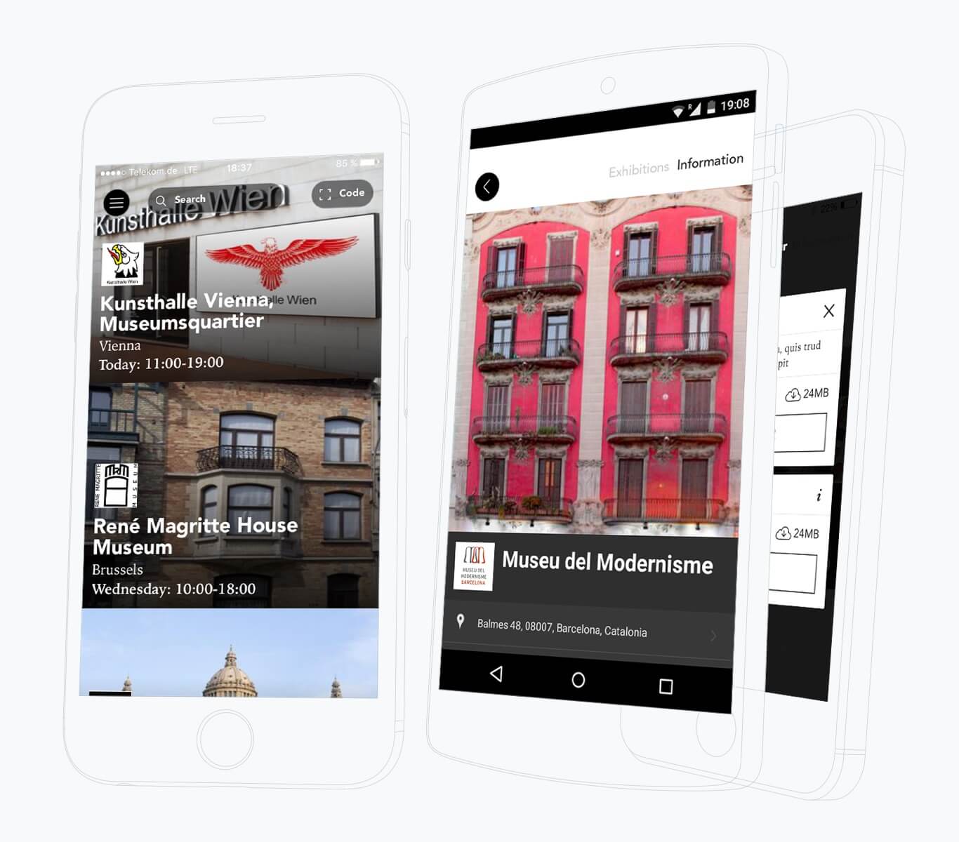
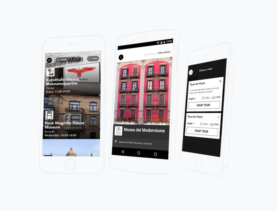
We designed the app from scratch, starting with design workshops with the client to figure out the base feature set that the new app would need to put center stage. Based on the budget provided, we agreed to run one user testing session in which two prototype concepts would be tested in comparison against the current app (at the time). The user session confirmed that the basic flows which lead users almost straight to an exhibit do actually work well.
Interestingly though, getting past the first screen was not as simple as expected. Three out of five testers wondered repeatedly how to get started (by tapping the museum photo). Luckily, it was a quick fix. We added a clear CTA to the starting screen at the end of the testing session and brought in a two more people to figure out the result. It worked.
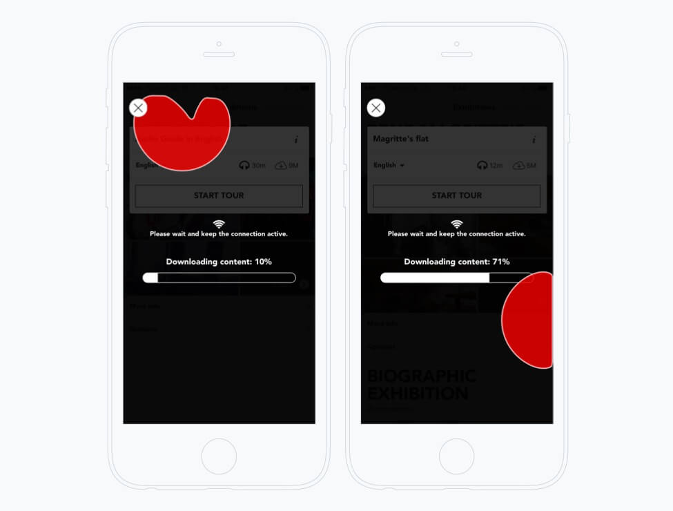
Reduce perceived waiting time
When the content loads, the user is encouraged to play a little game.
![Cloudguide: UX design, interaction design, backend, frontend engineering for mobile]()
Although their first app was overloaded with screens and related features, we were able to reduce and prioritize the given feature set in a way that resonated with their museum clients as well as museum visitors (the end users). Since launch, the apps have seen subtle modifications that have added additional content sections. The main flows and interactions have stood the test of time.
![Cloudguide: UX design, interaction design, backend, frontend engineering for mobile]()
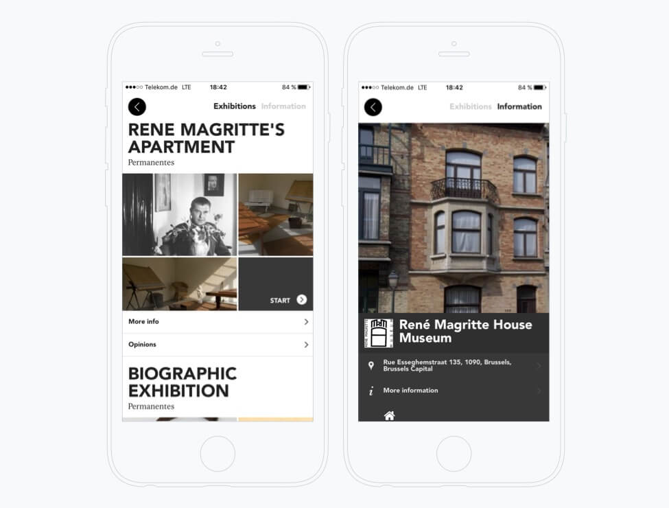
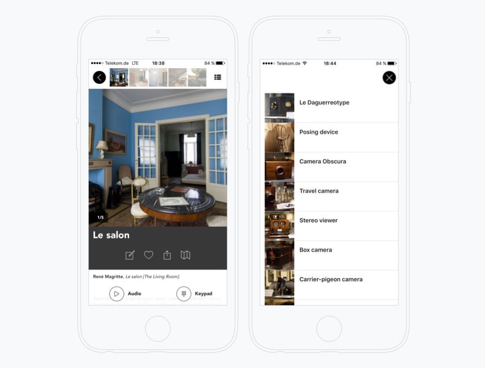
Showing gallery image and list view
![Cloudguide: UX design, interaction design, backend, frontend engineering for mobile]()
Stay on the edge
Get hands-on articles about innovation, UX design or engineering!
