

kraken.com Trading UI Refresh
- what we did:
- An internal challenge - our founder used the exchange and inspired the team to design a fresh UI
- what we achieved:
- A fresh looking UI for a technical-minded target group


kraken.com provides a platform for cryptocurrency trading. A user can exchange fiat for cryptocurrencies for about a dozen currencies.
Our founder, Andree, has used the exchange in the past. He felt that it would be a good internal challenge for 1-2 days of work. The idea was to come up with a refreshing UI that would consider the current structure or conventions used. Further, we wanted to not alienate the core user base with a random new UI style that feels distant, unconventional nor not approachable.
From a plain UI design perspective, it becomes clear that kraken either wants to appeal to a very technically minded target group or that kraken does not care about stellar and modern UI design. We feel that it is a mixture of both.
Summary of what we wanted to achieve (in 12 hours):
The current UI has a confusing navigational hierarchy.
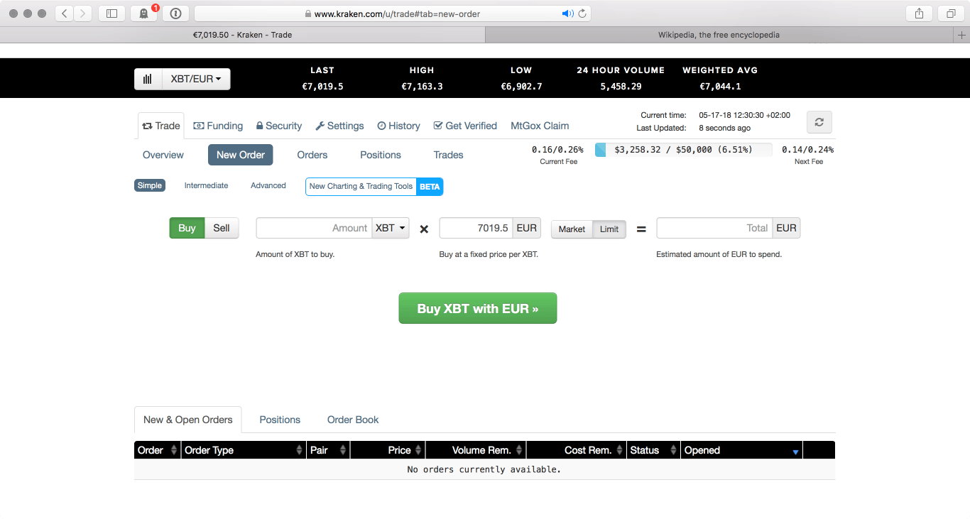
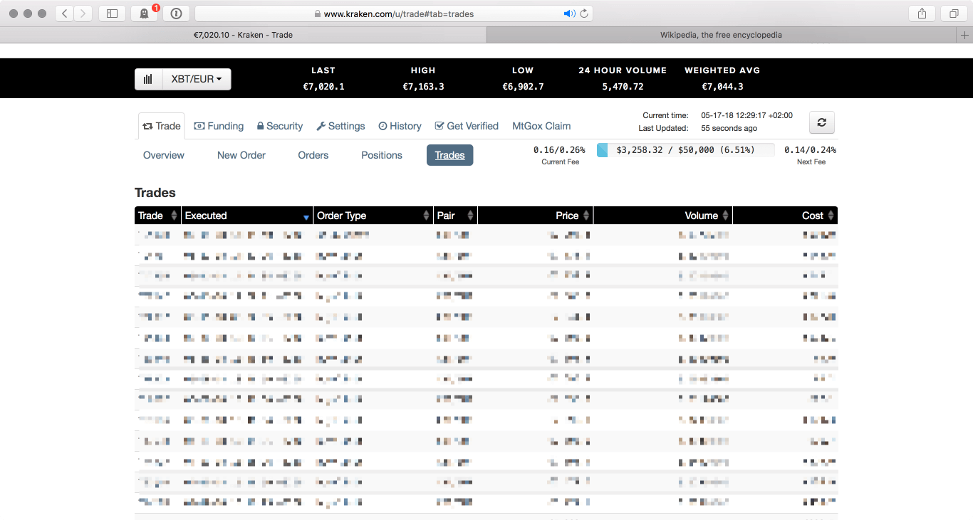
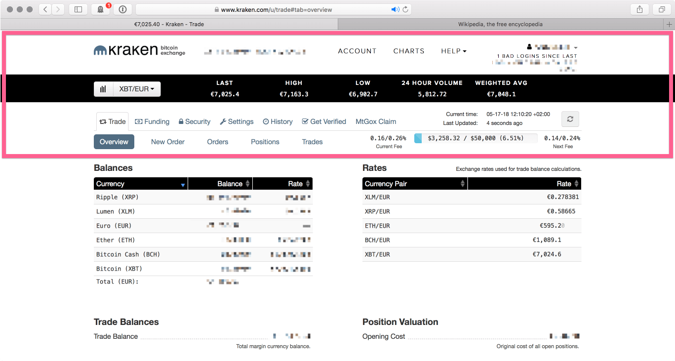 Current UI on kraken.com
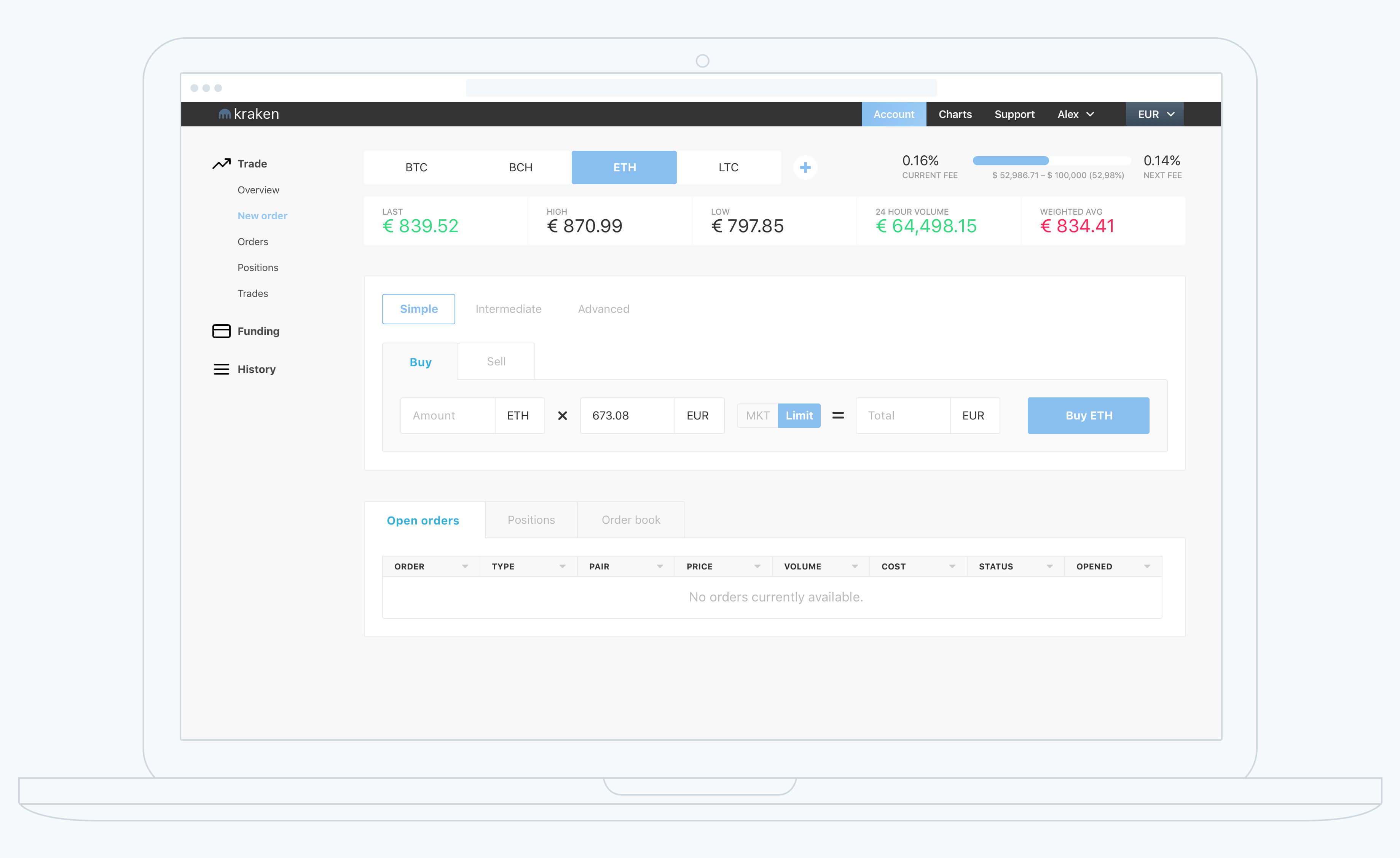
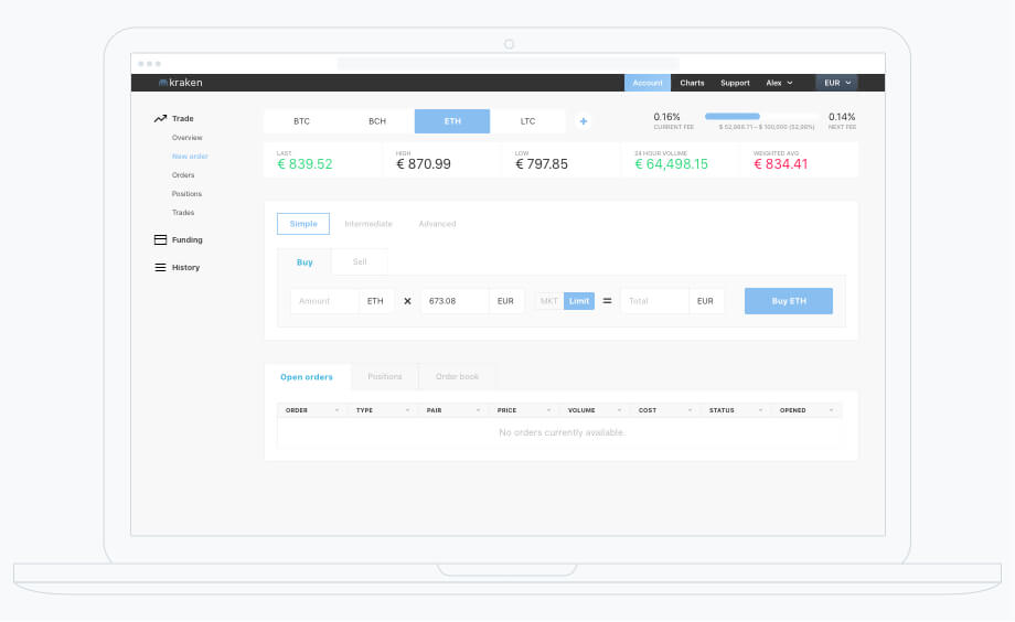
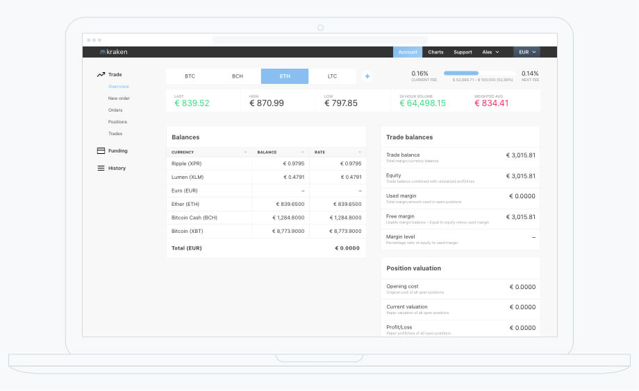 Our redesigned version
It feels a bit like everything is in plain sight, on purpose. The screenshot above shows a typical browser window width of 1366x768. Why 1366? The screen resolution statistics by W3Schools.com from January 2018 shows that 1366x768 is the most common display.
768 is the height of the display. Alas, the browser viewport height is smaller due to elements like browser nav bars. What we have seen from experience is that on average the available height for a website is about 640px. In the kraken UI, 39% of the available height in the browser is occupied by navigational elements. That is a lot of space for navigation to occupy only.
We wanted to maintain the structure in a way that a user is not put off but knows her way around the UI immediately. In order to achieve this, we had to reduce the nav elements but maintain a similar information architecture.
We restructured the level D and E and created a panel on the left for the most important pages/sections: Trade, Funding and History. The reasons for using a left column for the main nav is the aspect ratio of modern display. Due to its 16:9 nature, height is very expensive and therefore valuable. Based on the common sense of the team, we separate the subsections of the UI into 3 main sections and placed them in the left column.
Another small issue that each and every user will encounter is a Back buttons that appears on the right hand side. In the available time we set ourselves, we did not go into such details as it would have required to have a deep look at the navigation hierarchy across the entire app.
The result is a simplified nav structure that allows the main content to move up. This will result in better scanning of the UI and less up and down scrolling for the user.
A user-friendly UI design is still very rare in the cryptocurrency space (for various reasons). Currency trading is not for everyone nor does a majority of people engage in such activities. For even a niche in a market, a user-friendly UI does go a long way.
We are not fully sure what the main reasons for the very technical appeal of the UI is. The iOS app of kraken appears to be even more complicated than the website.
 Current UI on kraken.com
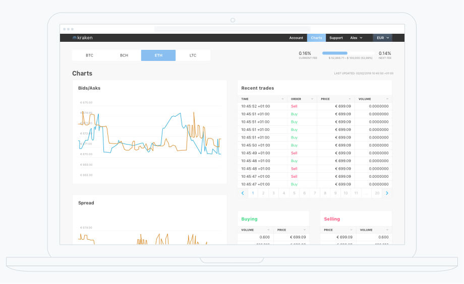
 Our redesigned version
The kraken UI is defined by numbers everywhere. It has a list for currencies used and their current price, a list of ones own balance, a list that shows the ledger for the account, a list for trade balances, a list of open and closed orders, a list for open and closed positions, and a list of all trades.
The biggest question that a non-expert trader will likely ask themselves is, that is the difference of some of those lists? What is the difference between orders and positions? What is the difference between all trades and the ledger?
There are probably valid answers to these questions above. But the questions centers around how often the user would want to view or review such lists.
Now, since the challenge was time constrained, we did on purpose not aim to solve the list problem. What we did though is to give the list elements is less technical, number-driven aesthetic. See for yourself what you think.
 Current UI on kraken.com
 Our redesigned version (not a UI design for the screen above)
Get hands-on articles about innovation, UX design or engineering!
Want to come up with a new digital product, expand your existing business, stay competitive? What's your next step?
Get in touch with Andree Huk
at +49 30 5557 7174 or [email protected].