Wallapop: How A Subpar Mobile Experience Can Hurt Your Brand
Feb 13th, 2018 - Written by Sara
We usually do not write about applications in detail but in this case, it is worth the effort as our Experience Director can share a personal experience - but let him explain in detail. Enter Andree.
• • •
About 6 months ago I started selling a few items on Wallapop. A seller has to use the mobile apps to list items, in my case I use the iOS app.
I was not required to sell anything rapidly and I did not want to sell anything at a steep discount. So, the following experience is based on a month-long experience, not a few days. This matters quite a bit because one could happen to be exposed to a version of a mobile app that was insufficiently tested - by accident.
Apparently not.
Here is the thing: I am not doing any advanced stuff. This so called real-world usage, not some theoretical testing. I use the app in ways that probably 80-90% of users do too. No rocket science usage or testing.
Summary
- App Store “BEST OF 2017” is really surprising to me, looking at the issues at hand
- The issues are not new: though all screenshots and recordings were done with v1.38.0, I have noticed many similar issues starting with v1.26 (unfortunately, I did not keep all of them)
- Some other (not detailed) bugs got fixed since August 2017
- The issues could be either results of insufficient feature or insufficient interaction design definitions
- I guess that the Wallapop product teams do little exploratory internal testing. It is not hard to discover the bugs I detail out below
- The rationale for not fixing certain issues could be either:
- “People sell most of their stuff immediately, so it does not matter to fix bug X”
- “We do not invest in mobile because letgo is more important than Wallapop”
- “We only invest in marketing”
- Not sure where the 40 - 100 million of venture funding really went.
Interestingly, I somewhat felt an urge months ago to put this into writing but recently the tide changed. Firstly, because the experience just does not improve that much with time. Secondly, it gets really frustrating when you yourself are involved in software engineering and have such an experience.
But where do we get started?
Insufficient feature or interaction design definitions
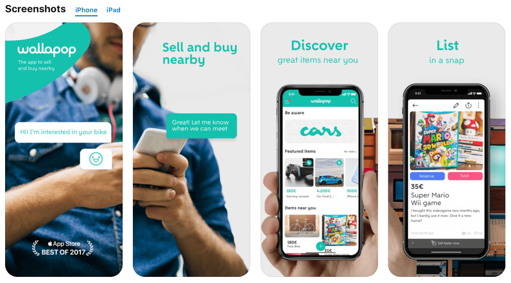
Upfront: I just saw this screen visual in the App Store page of Wallapop. Notice the BEST OF 2017 banner at the bottom? OK, that is hard to miss with the arrow.
To say it mildly, I am surprised to see this and got to wonder.
Some rough assumptions for the ongoing issues are the following:
- Insufficient definition of product features
- Insufficient definition of interaction design (patterns)
- Insufficient testing of the above because it was never defined at the outset
- Insufficient testing of the app in general terms (e.g. no exploratory testing)
But let’s get to the details. I will only explain those that IMHO should be fixed. A few others, like hidden input fields (with open keyboard), have already been fixed.
1. Issue: Bothersome navigation.
Use case: As a user I want to navigate between the sections of the app as quickly as possible.
This is such an interesting detail. Albeit a very tiny one, it has such dramatic repercussions. Here is the video, do you notice the issue?
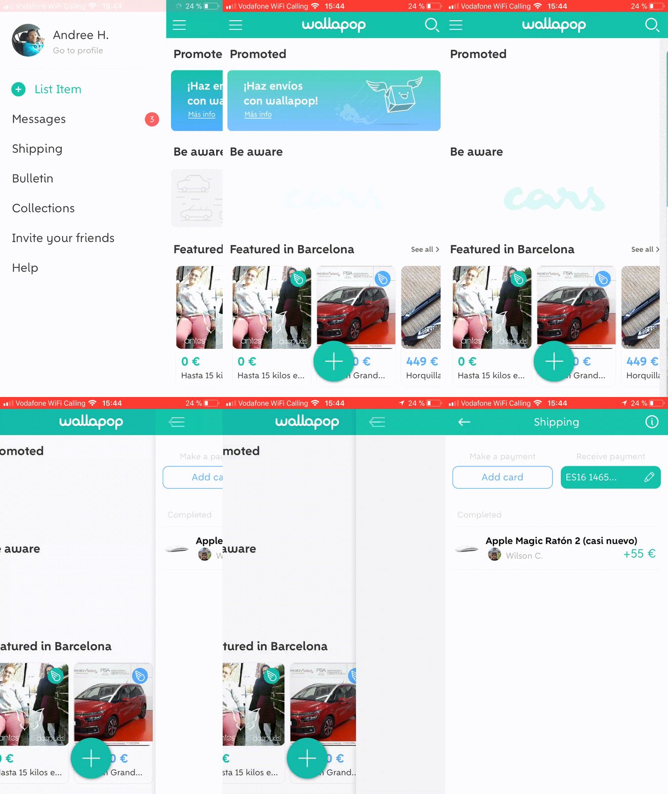
Issue: Whenever you tap a menu item, you will get to the main section of that item. Now, without going further from that very screen, in order to see the menu again, you have to tap the Back arrow first (top left) and then the hamburger icon to see the Menu. This bothers me so much that I do not want to get this down in writing.
The result is that whenever you navigate on the highest level you have tap 100% more than you would actually need to utilising the correct navigation pattern, which is: when a user is on a main section screen like Messages or Shipping the nav bar always shows the hamburger icon at the top left. This way the designer cuts down about 50% of navigational excise required by the user. 50%! Amazing how much effect such “tiny” details can have.
This is so standard practice that I am still surprised to see this at a company that raised north of EUR 50 million.
2. Issue: Adding/removing images.
Use case: As a user I want to add images without being required to remove one first
Wallapop only allowed you to add 4 images when I started using it. Recently they added an allowance of 8, or did they not?
Out of nowhere came this:
While writing this very line and testing to add another item in the app, I encountered this curiosity: At times the app offers 4 images to be updated, a few minutes later it is 8. And then back to 4. I have no idea what is going on and cannot reproduce either case predictably. Perhaps they can change this on-the-fly through the backend.
Perhaps but back to the initial issue.

During much of the time I used it, it was 4. Now, the fewer images an app allows the more it makes the user think about which images to include. This implies that the mechanism for adding and removing images should be well thought-through and implemented.
Side note: In versions between mid to late 2017, I encountered issues where the thumbnail just did not want to appear right after adding the image. I had to either Save or add a description (go to new screen) and then go back for the thumbnails to appear.
Well, the mechanism for removing images is this:
You have to remove an image first before adding a new on the same spot. Tap placeholder image, tap Remove, tap placeholder image again to add a new image. That may be OK, you say, but consider this the following.
In order to add 4 images you have to do this:
1st image
- Tap
- Select an album
- Select one image
- Add
2nd image
- Tap
- Select an album
- Select one image
- Add
…and so it goes, for all 4 or 8 that you may want add!
Why can’t I just add 2,4 or 8 images in one swoop? Why cannot I simply replace one?
3. Issue: Pasting text does not work.
Use case: As a user I want to re-add a listing that has gotten old.
I mentioned initially that I was not stressed by time selling my pieces. Hence, at some point I would need to re-list an item. What would a user do in such a case?
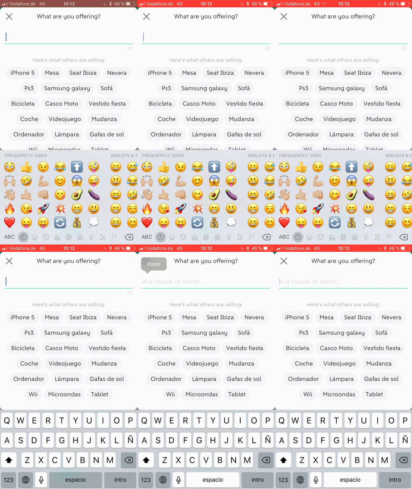
- I edit the item that is still listed
- Tapped on Edit
- Copied the title
- Went back to the menu
- Tapped Add A New Item
- Then pasted what I had copied
- Fail.
Apparently, copying and pasting isn’t working. Hmmm, it isn’t such crazy a feature, is it? I remember a time when the first Apple nerds, me included, got desperate because copy+paste was not implemented in the first version(s) of iOS. These days have past.
Still, to no avail.
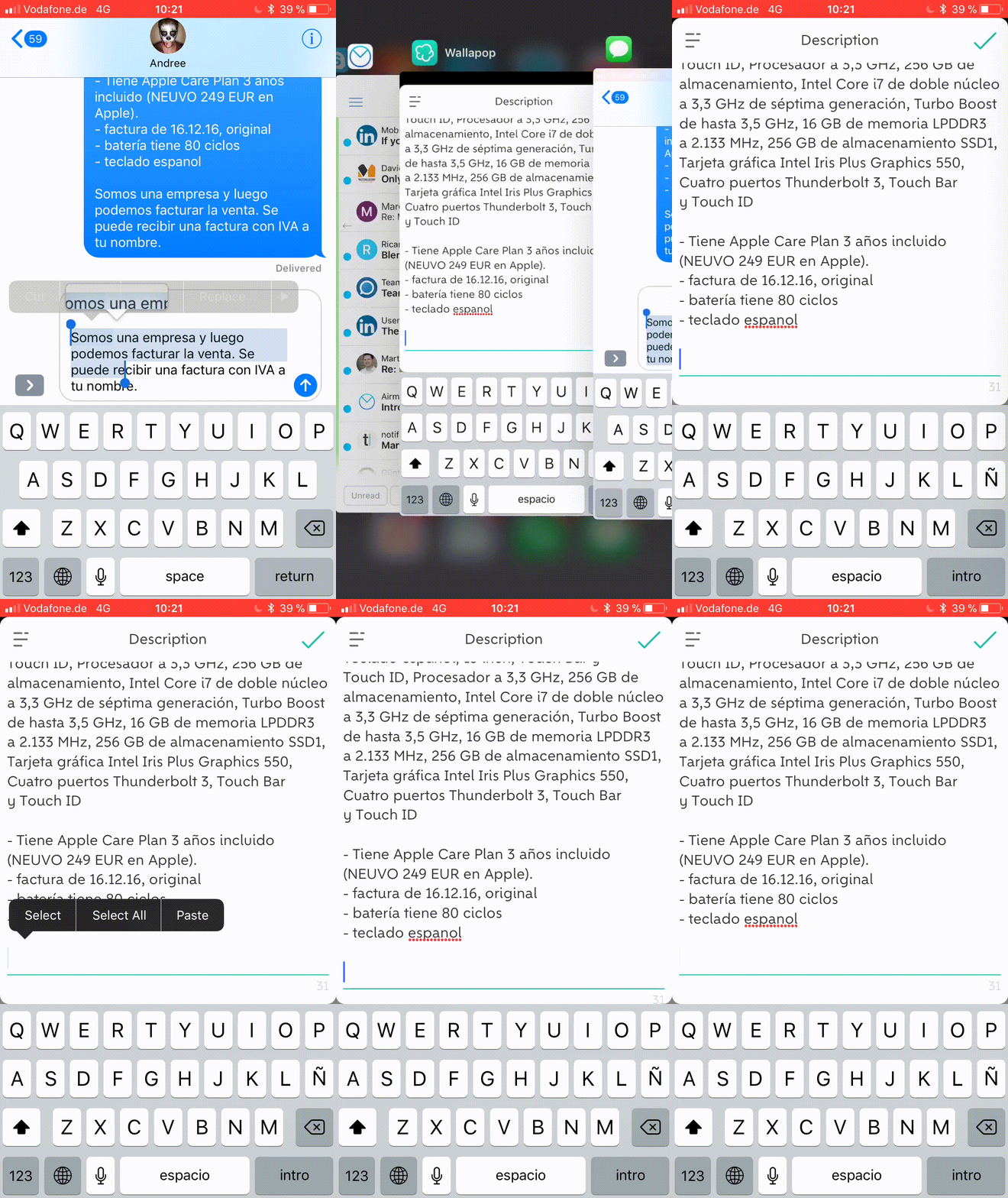
What would you do to get around this? I have to paste it somewhere else, than jump back and forth between the Wallapop app and the other “short-term storage”-place to read and rewrite what I had used.
And, of course, I had to do this for the title and the description. Yes, the description - which is usually quite a bit longer - as well.
Update: Copy+paste is working actually. I wonder what the issue was. Perhaps Wallapop changed the length of the title and description text recently. So when I tried copying the older, longer title, the new field did not accept the input because of a shorter allowance.
4. Issue: Scrolling the page.
Use case: As a user I want to edit the description so that I can or remove parts of it.
This perhaps relates to the issue above. But I am not sure.
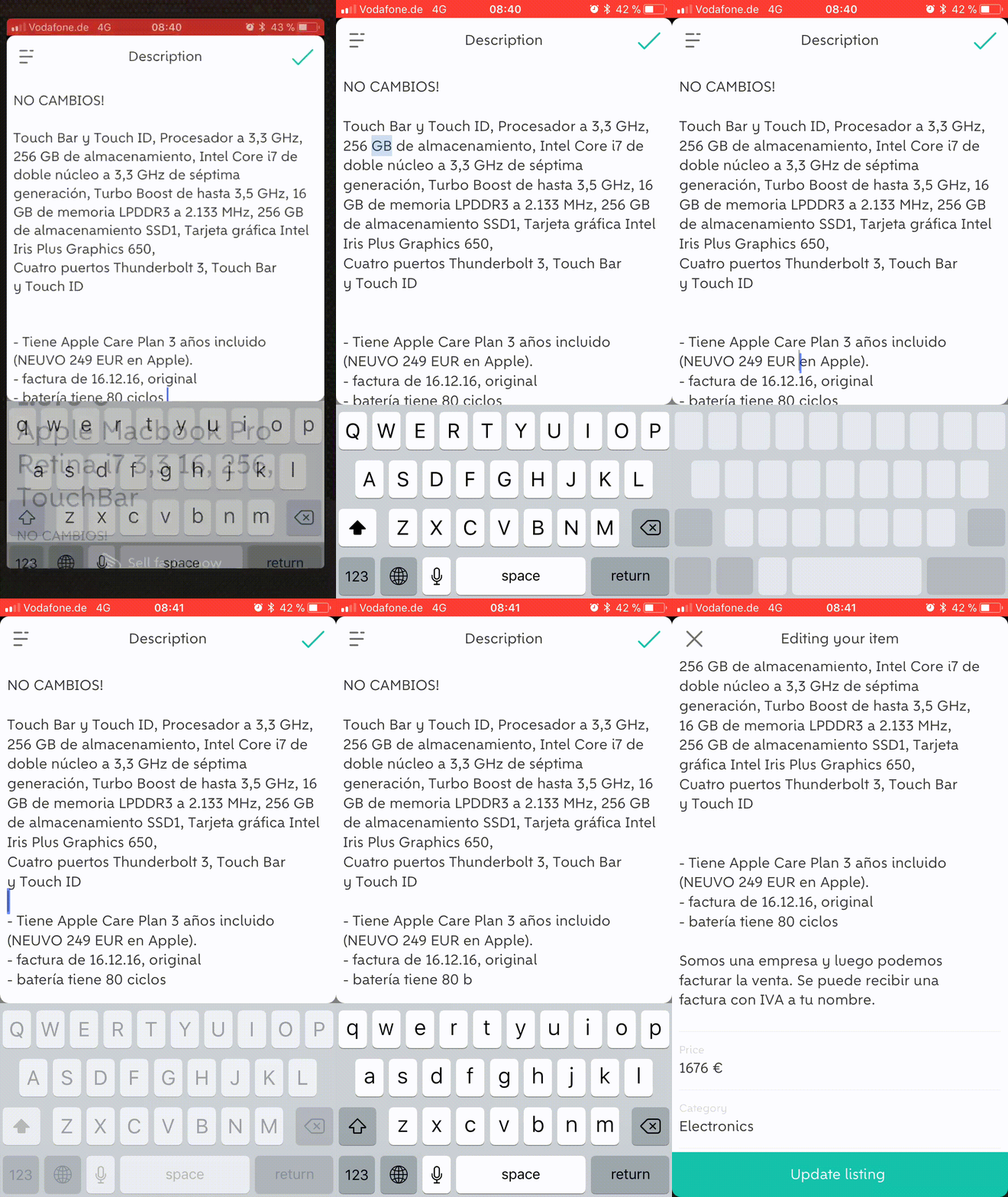
What you do not see on the recording, of course, is where I am tapping to modify the content, navigate around. I go back and forth between the listing overview and the Edit description screen, trying to have the actual input slide up so that I can continue editing.
Nope. Not working.
Side note: At the beginning of the recording I start on the Edit screen. Then I tap Save to get back to the overview, then I tap the description again to Edit.
Do you notice an interesting aspect? The overview screen slides in from the right. In fact, should not the current Edit screen slide out to the right in order to indicate that I go back to where I came from? Yes, it should.
Here is a video for illustration purposes:

Wrapping up
Bugs have a plethora of reasons, e.g. missing/wrong design definitions, incorrect feature definition, moving priorities, insufficient testing before a release etc.
The issues above may actually not be bugs but rather exact implementation of certain feature. For example, “Add/remove an image” is certainly no bug, neither from a design point of view. Although technically working, it is certainly subpar interaction design. You can experience this when switching to Instagram for example to see how they implemented “Add >1 image at a time”.
IMHO the Wallapop app has still lots of room for improvements.
Hey Wallapop, it would be great to discuss the above.
Want to come up with a new digital product, expand your existing business, stay competitive? What's your next step?
Get in touch with Andree Huk
at +49 30 5557 7174 or [email protected].