UI Libraries: 5 Hands-On Tips For A More Efficient Workflow
Dec 5th, 2017 - Written by Andree Huk
Libraries based on Nested Symbols are now the bread and butter for designers. Using such libraries in more efficient ways will give a designer an edge over their competition.
Summary
- Nested symbols have bottlenecks that slows down work
- Luckily, a handful of tips can greatly improve ones efficiency and task completion velocity
- 80% of tips are native to Sketch, the rest might be a plugin going forward
Nested Symbols in Sketch are great. Even better are Nested Symbols in combination with the Library feature. This was one of the main reasons that blended.io made the switch from Omnigraffle to Sketch for Interaction Design. Sketch had and still has its issues for other parts of the process though.
We had started to build our own stencils, symbols, and "libraries" (prior to Sketch 47). Out of curiosity a team member started playing with a library from around the web. This library was designed by fellow product designer by the name of Jan Losert. It turned out to be an intriguing library so that chose to test drive it.
The logic behind nested symbols: My brother works in Excel very often. He once told me that I always have to refer to another cell when building up formulas in spreadsheets. By doing so, one can build smart logic. In fact, Nested Symbols in Sketch can work the same magic, though, in visual fashion.
Always refer to another cell when building up formulas in spreadsheets.
We have been using this library for some time now. It is very complete and versatile. Since then we have added a few tidbits and made some subtle modifications. As this library is available online, we like to share some bottlenecks and potential improvements for the community to tinker with and improve.
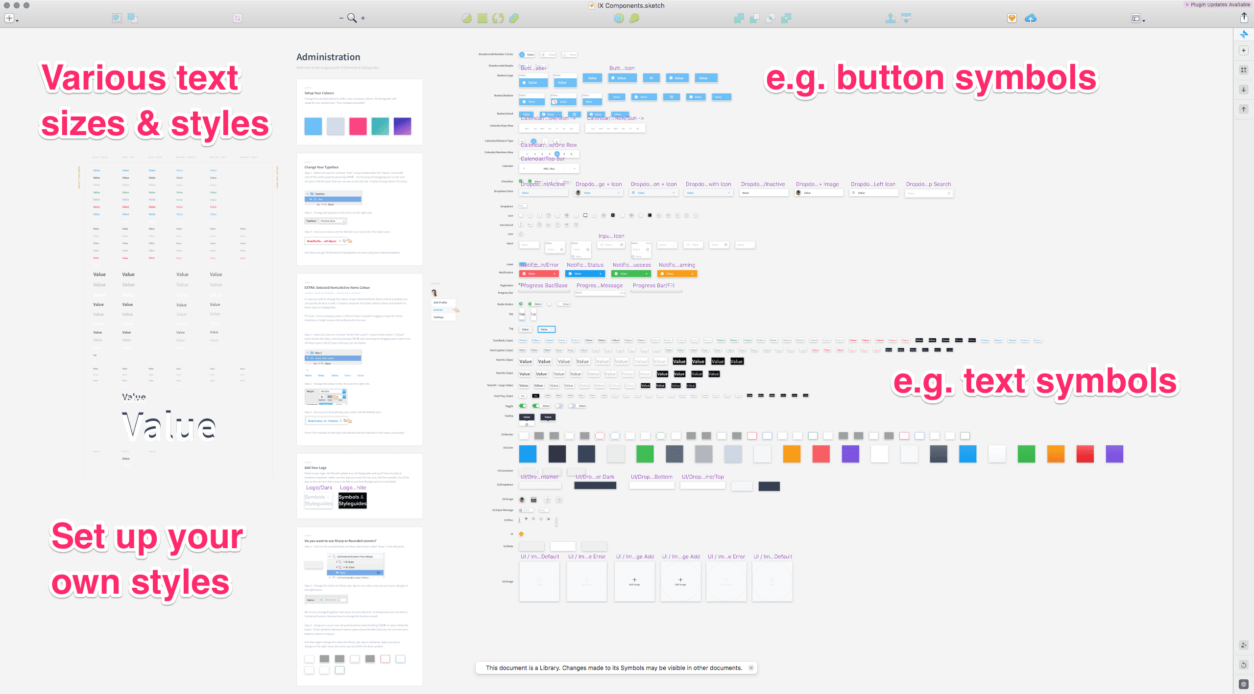
The library: Nested symbols and style-guide
On the screenshot above one can see all symbols and elements that the Sketch file contains. The UI kit comes with set of files that contain entire style guide based on that symbol UI kit.
The symbol UI kit contains a handy setup guide for customisation (see field Administration). A set of layout copy in various sizes and colors is the base for the UI kit. These styles come in such flavours as “bold center aligned”, “bold left aligned”, “bold right aligned”, “regular center”, for example.
The right hand side shows the plethora of symbols that are used to construct almost any UI element one can think of (above).
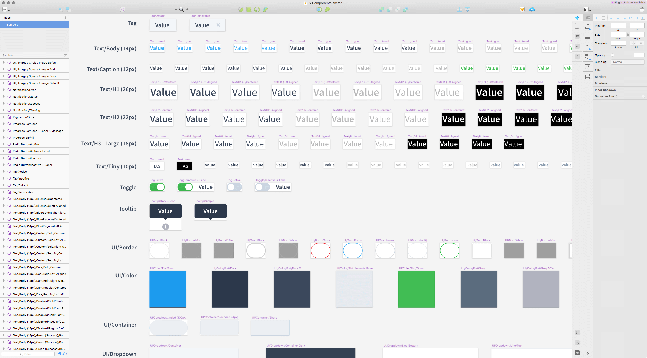
Nested Symbols are the very base for the UI kit. Any component (e.g. Button Large/Medium/Small) that contains texts have a text symbol at their root. Here for example: various Text/Body or Text/Caption symbols.
Of course that makes total sense. So, for example, if you want an input field shown as an error state, you would select the right Text symbol in the overrides list. If you want a different border color, change the UI/Border symbol.
The nested symbols cover a whole lot of states and cases, for example:
- Buttons in large, medium and small
- Copy for white backgrounds
- Copy for black background
- Square or rounded buttons or input fields
- Various states for input fields, e.g. error or inactive states
- Dropdown in all required states
This, however, is where things can get cumbersome.
The bottlenecks
Unique fonts
The UI kit in question comes in three difference fonts flavours: Source Sans Pro, Roboto, and Proxima Nova. It is likely that you want to change to a different font. It does usually work well, though, we had experienced issues with a few fonts that have some unique differences, perhaps due to baseline or cap line. Unfortunately, I cannot provide you with a visual at the moment as this was bought up to me by a team member.
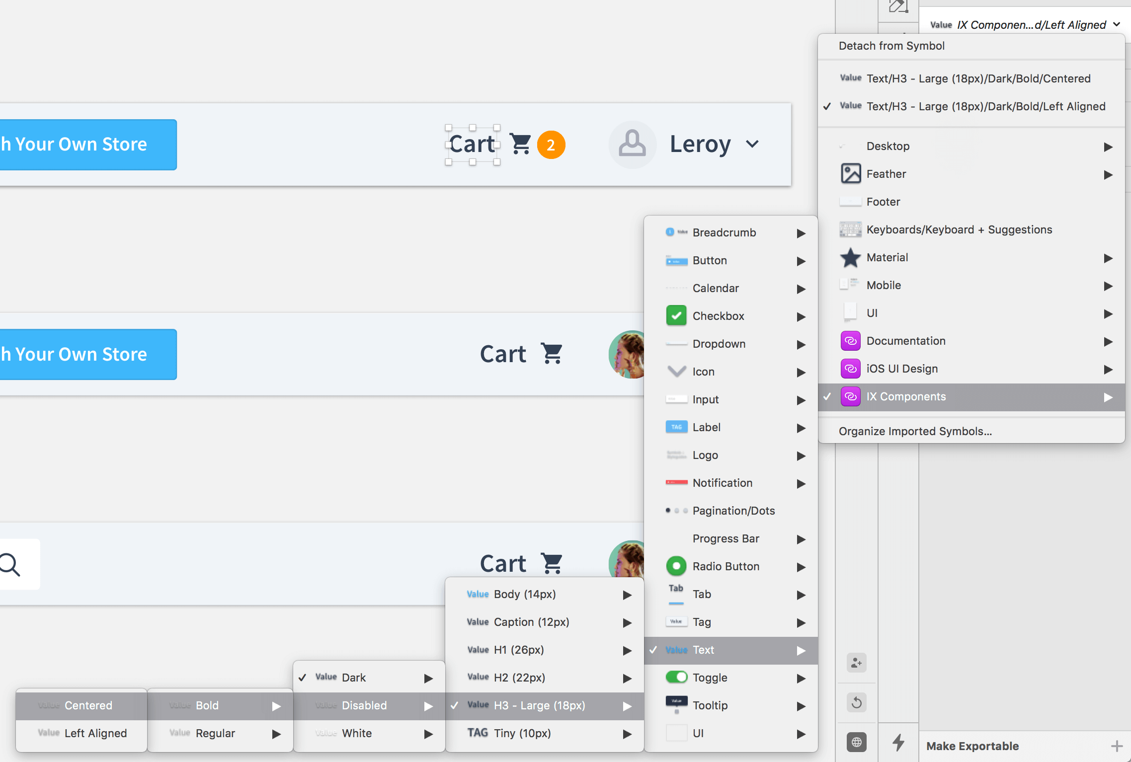
Selection of symbols or nesting complexity
The issue is are mostly related to the nature of Nested Symbols and how they are selected to be placed in Sketch. As you can see from the image above, complex nested symbols can get deep in structure. In order to change a symbol one would have to follow along often to the end of the symbol tree.
This may look like an OK effort for a couple of times but it does become a bore soon afterwards. Again, this is not due to the UI kit but the nested symbols logic itself as well as the UI employed in Sketch. The overrides section does provide shortcuts (see options below “Detach from symbol”). But, unfortunately, that is not always an option or desired.
Using symbols for any copy
When you add text copy to an artboards, you do not want to do add a text symbol first. You may be in the “Let’s use symbols for everything-mood” but unfortunately this will fire back. The best way is to add a default text element and then apply a text style. Using a symbol has two main issues: a cumbersome selection of buried styles throughout the Override menu and the fact that the overrides input field is pretty short. These fields are not made to contain longer copy like paragraphs.
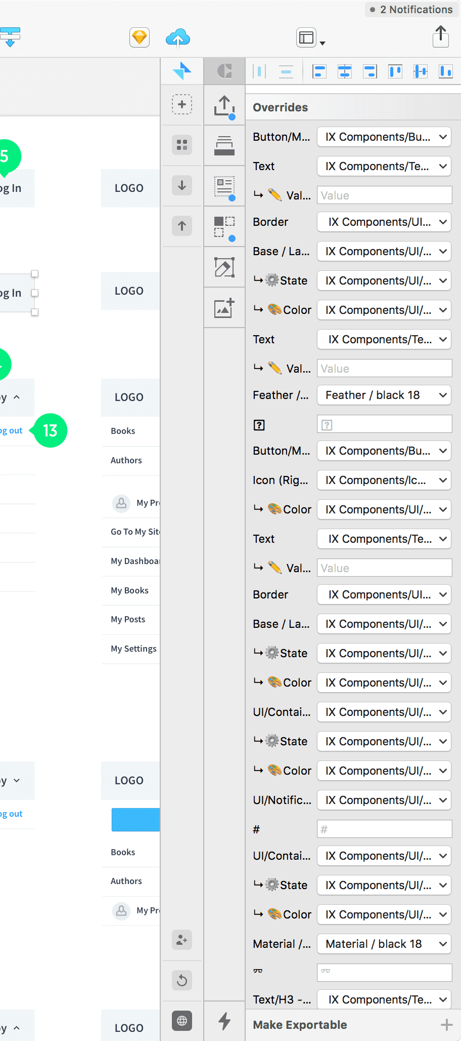
List of possible overrides
When you combine the nested symbols from the library UI kit with other elements into local symbols, the list of overrides will get incredibly long (see above). There is hardly any solution for that. Further down we offer a solution to this problem.
Long titles or symbols names
Keep it short and sweet. As you see from the screenshot above, the layer names get truncated very quickly. The shorter the names the better to recognise. This also counts for filenames of libraries. The names of the library file leads the copy in almost all overrides dropdown. Although that may be OK to have, the layer names have to be short and sweet.
Solutions
Luckily, the solutions are short and sweet.
Unique fonts
We have been testing a dozen font types. About two of those did have some issues. Therefore, you are about 83% safe (a rough measure of course).
Selection of symbols or nesting complexity
This one is somewhat tricky though. Placing symbols through the native UI poses the same deep structure issue we encountered beforehand. The best way of placing symbols from libraries is indeed through Sketch Runner. It does come with another issue, namely: Since symbol names can get long, the names truncate in the Sketch Runner window. A fix might be on the way. Furthermore, it would be awesome to be able to change the overrides through Sketch Runner direcly (or perhaps at least the copy).
Using symbols for any copy
Simpel fix here: never use symbols for copy. Always place default text and then apply a style through the selector panel.
List of possible overrides
This is easy to solve but may take some time upfront. The sorting of the layers of a symbol itself determines the sorting of the overrides. Therefore, a designer should carefully sort the layers across all symbols in a consistent fashion. This consistency makes reading through the override list and recognizing the desired layer (aka override) a breeze.
Long titles or symbols names
Keep it short and sweet but keep the user in mind. It is likely that other people will use the library at some point.
bottom line The UI kit by Jan is well designed and a great starting point. Give it a GO.
Want to come up with a new digital product, expand your existing business, stay competitive? What's your next step?
Get in touch with Andree Huk
at +49 30 5557 7174 or [email protected].